
Plan Your Vote
tldr – what's the project about?
Plan Your Vote is a microsite created by the City of Vancouver to help citizens choose candidates, along with a voting day and location – serving as a single touchpoint for learning about candidates, allowing citizens to pre-select and print their voting plan in the order of the ballot.
role + timeline:
My role was creating an accessible user testing plan, and using the research to inform the updated UI proposals for the 2018 municipal election scope.
We shipped these changes in 5 months (since the election can't be delayed), with a team of 2 UX designers, design lead, 4 developers, and a PM.
success metrics:

Recognized accessibility improvements
The accessibility updates were recognized and highlighted by local accessibility groups

89% increase in election webpage usage
Contributed to an overall stronger digital strategy for City-provided digital resources
Ah yes...Voting!
You've probably voted before...whether it's federal, provincial, state, or municipal. Something routine where we access candidates and choose who we want to represent us. And depending on where you vote, you may have felt overwhelmed from the amount of candidates to choose from..
That's the goal Plan Your Vote aims to solve. This tool gets released every 4 years during the municipal election, and I helped to inform some of the changes for the 2018 version, improving on the 2014 version.
High level, there were two major focuses to solve for 2018: accessibility needs and random ballot order.
Accessibility First
Feedback from the 2014 version revealed significant accessibility issues, particularly for blind, low-vision, and mobility-impaired users. Key findings included:
- Blind users lacked ARIA feedback for screen readers.
- Screen magnification users struggled to find buttons and input fields.
- General users found information architecture difficult to navigate.
Key Insight:
To provide an optimal vote planning experience for all...we need to optimize accessibility needs for the 2018 scope
158 Candidates and Random Ballot Order
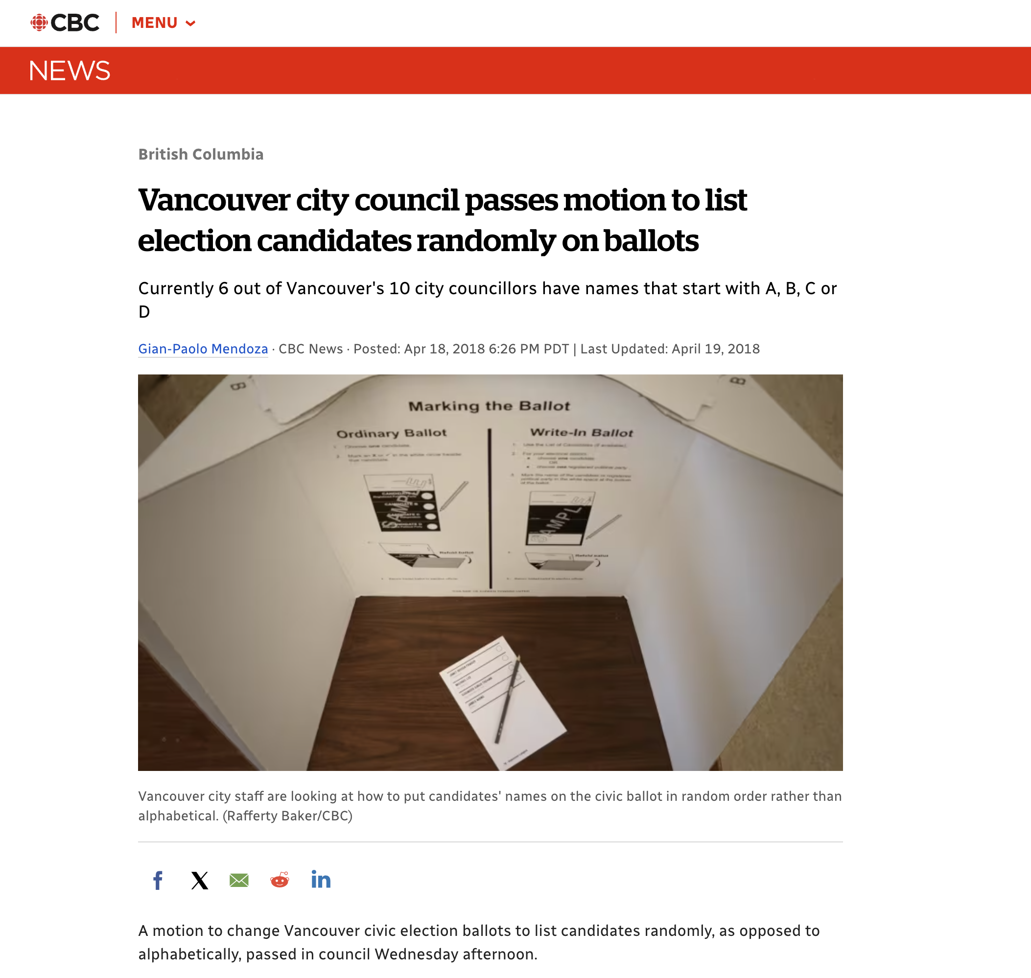
Typically on election ballots, candidates are sorted alphabetically. But the City decided on a pre-defined random order of candidates in 2018. The reason behind this was to reduce cognitive bias of candidates near the top of the ballot.
With 158 candidates to choose from, this was going to be a bigger change for citizens – and could potentially lead to longer times in the voting booth to find their candidates on the ballot.
To mitigate confusion, we updated Plan Your Vote to align with the ballot order. When creating a vote plan, it would match the same order as the ballot, with the goal to reduce any cognitive confusion.
Moving to a Solution
To prioritize accessibility for the 2018 scope and make the right changes, we conducted user testing for individuals with individuals who were blind, low-vision, and had mobility needs. I helped to write the test plan and conduct user testing.
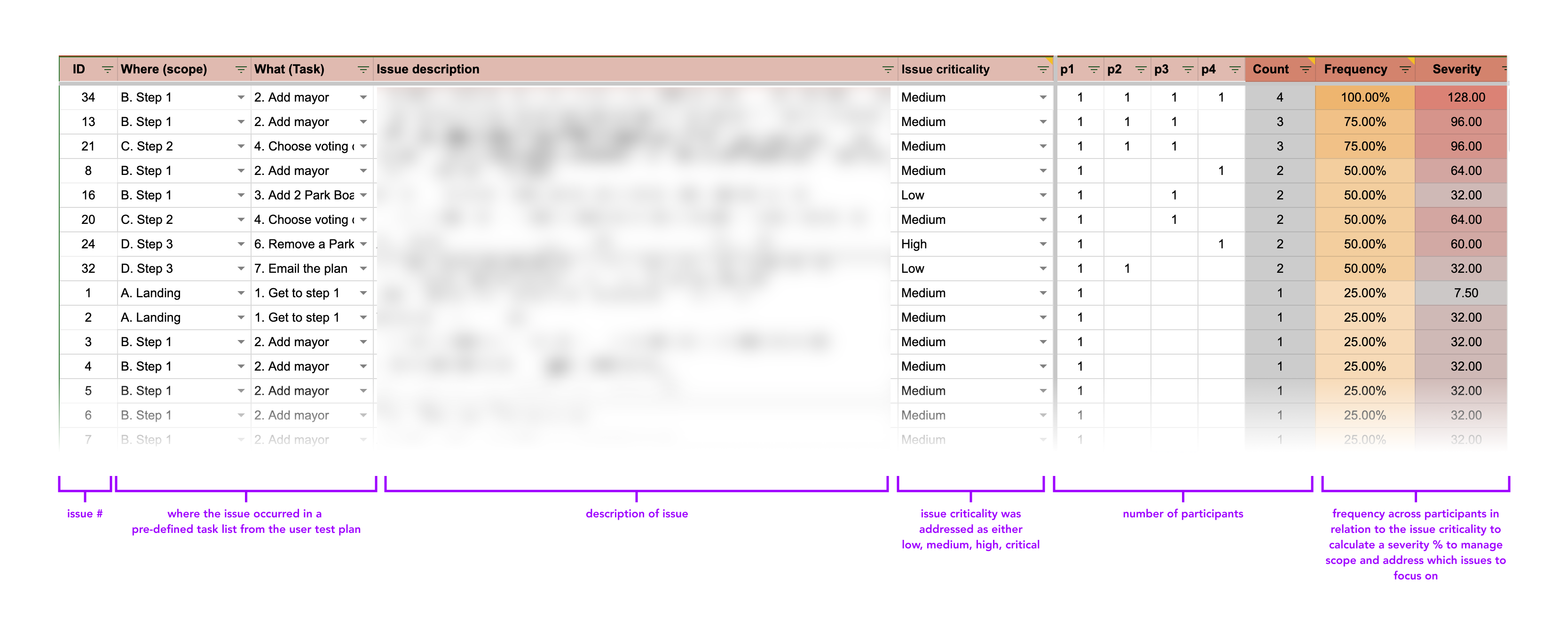
We identified over 60+ issues. Based on findings, we implemented the following key improvements:
- Enhanced ARIA support for better assistive technology interaction.
- Clearer information architecture for improved readability.
- Accessibility information added for all voting locations.
Outcome:
To manage scope, core UI areas were revamped, focused on emphasizing candidate selection and voting location with improved information architecture and accessibility features.
My direct contributions included:
- Improved ARIA support for screenreaders
- Clearer information about the context of the page
- Added accessibility information for voting locations
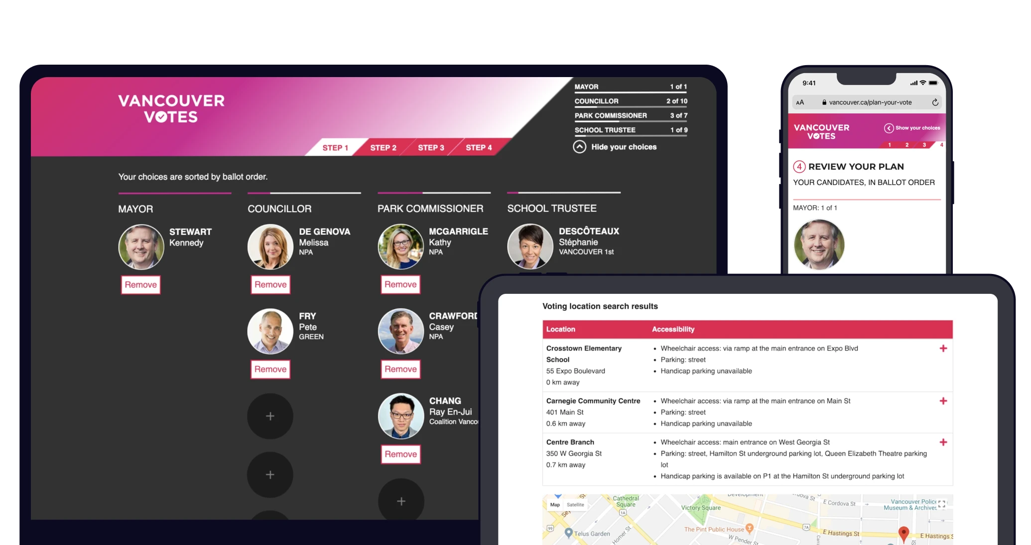
Updates to Candidate Selection page:
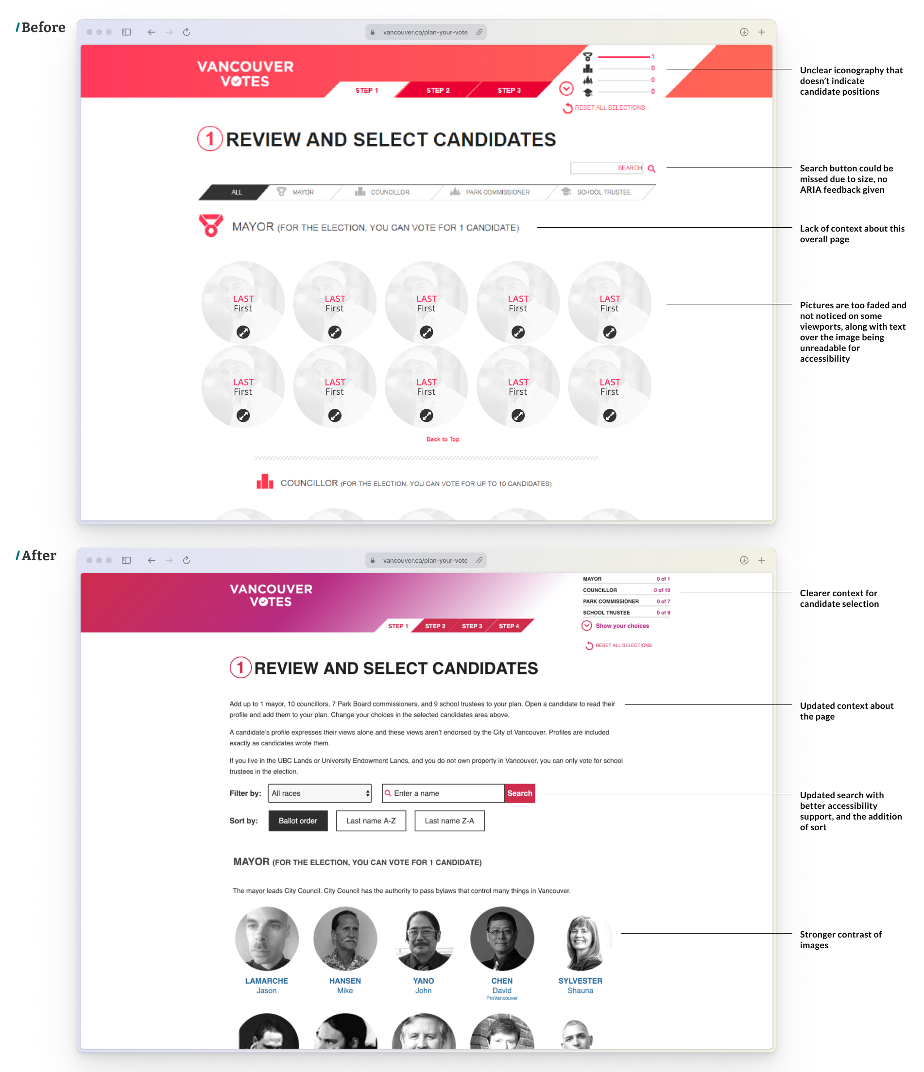
The updated home page provided clearer numerical context about the candidates chosen (text vs. unclear icons), updated copy to explain the page function, a more clear search functionality, and better contrast of images. Better ARIA support was updated as well.
Candidate overview and review:
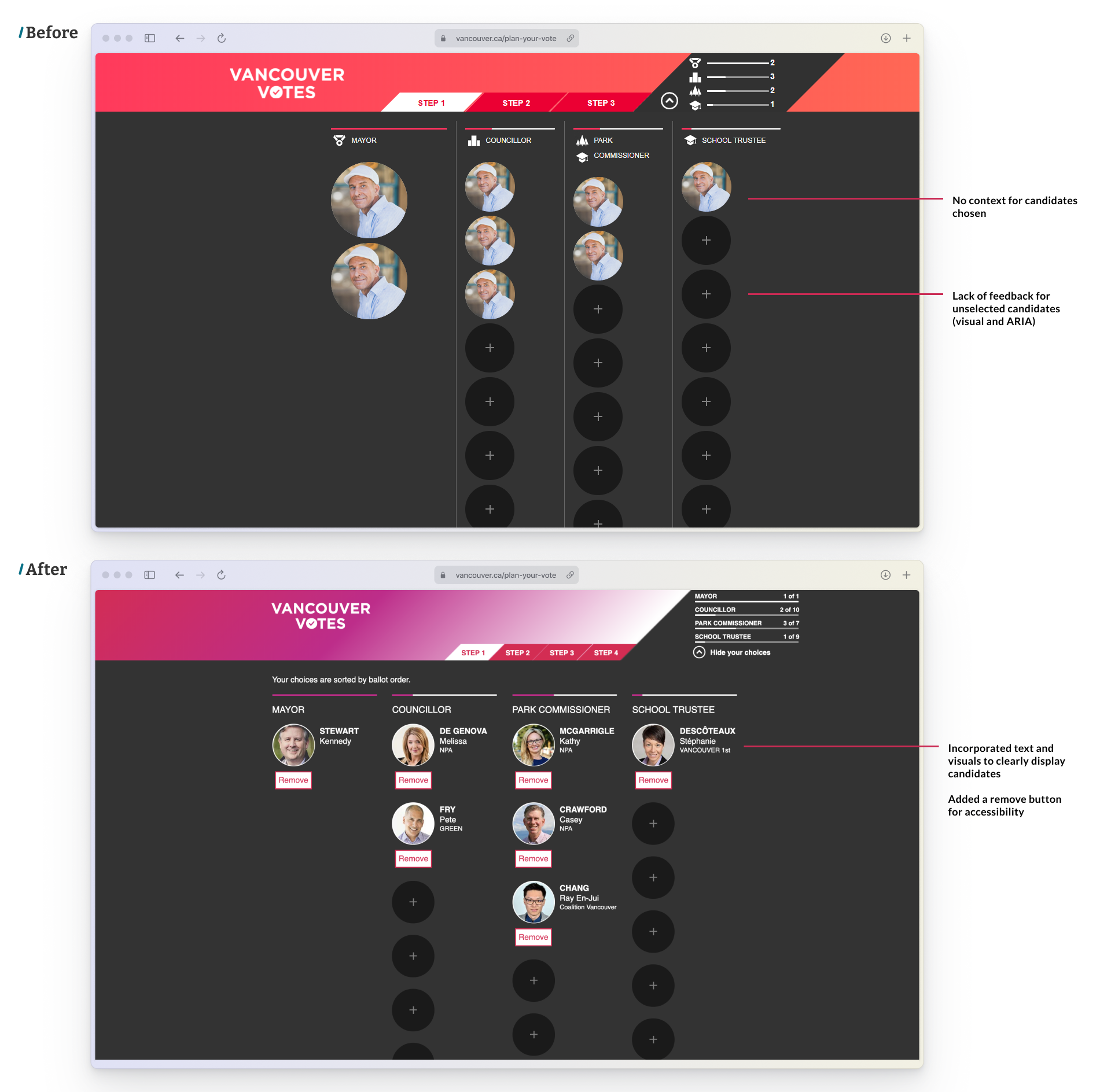
Updated candidate selection and review candidate screens, with more clear actions to remove candidates and see their information.
Location Selection:
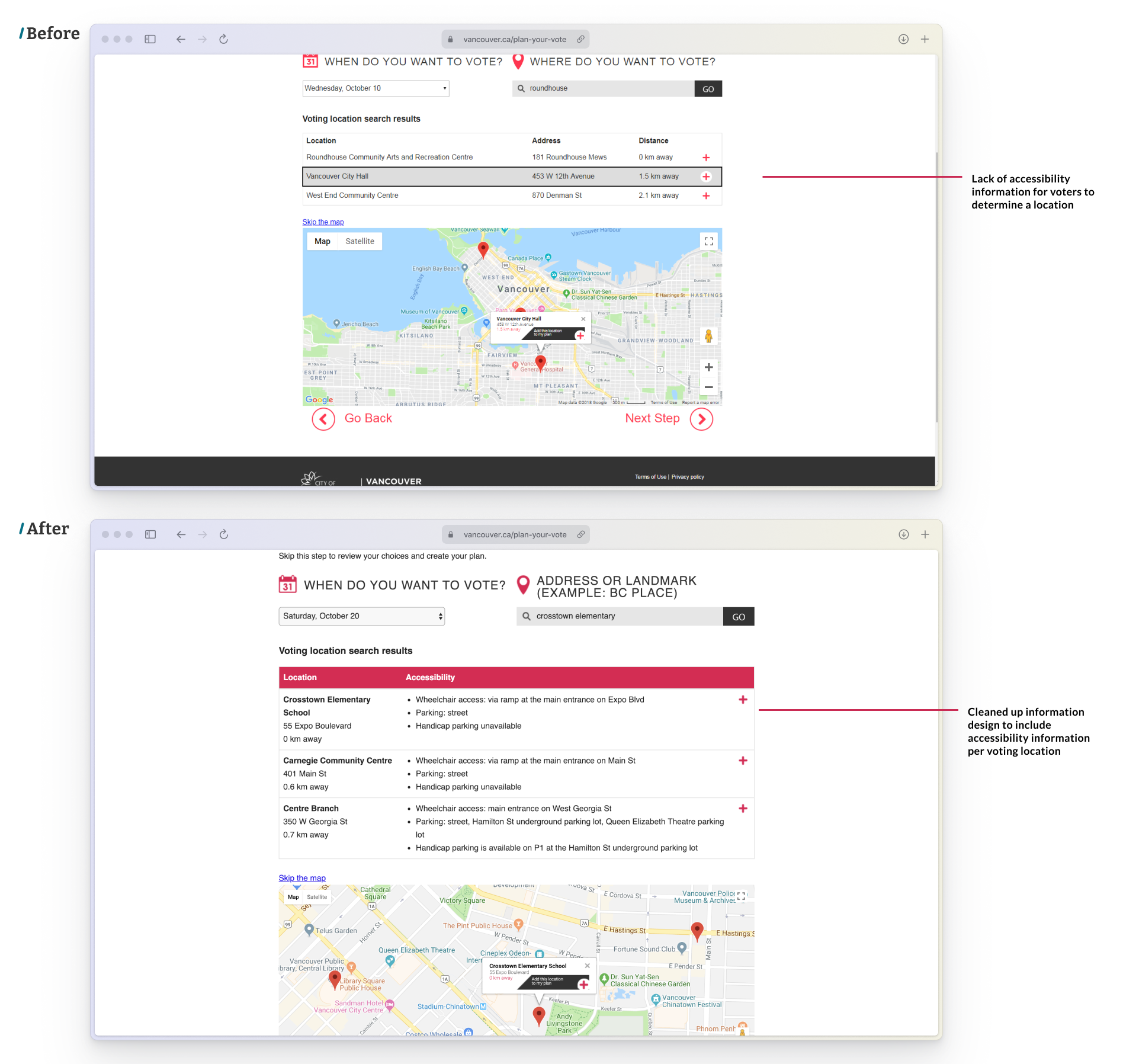
Choosing a voting location was revamped, to include accessibility information about voting locations.