Supporting financial well-being through credit score awareness, management, goal-setting, and education
tldr – what's the project about?
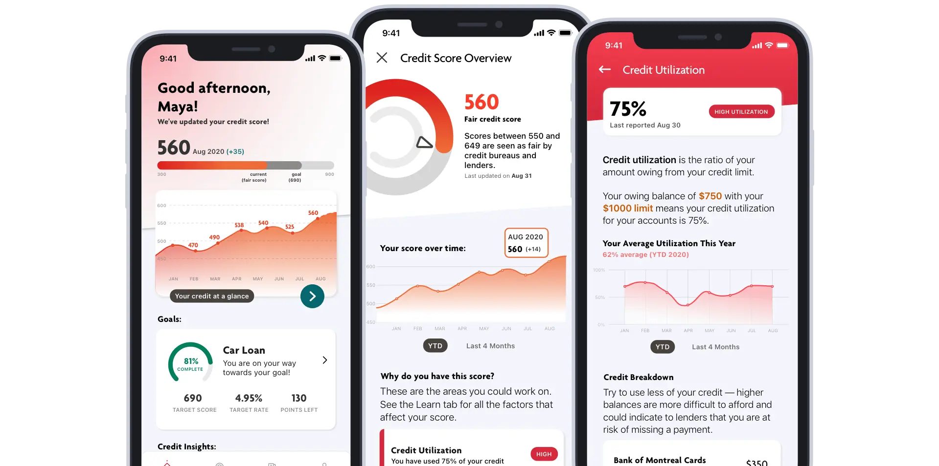
"Vancity MyCredit" is a companion application for Vancity members to manage their credit and set goals that encourage credit building, to better support their financial well-being.
role + timeline:
My role was prototyping and animations, user testing, product strategy, and UI design.
project recognition:
2019 SFU FCAT Undergraduate Conference Presenters
The project was also showcased to the yearly department conference
Why Financial Credit?
Financial credit is an important aspect of Canadian’s financial history, and an estimated 56% of Canadian’s have never checked their credit score (Bank of Montreal and Pollara).
As one of Canada’s largest non-profit credit unions – Vancity can help deliverer digital offerings that can benefit their members and communities. And since almost half of their members interact almost entirely digitally, this would be an added value to their digital functionality.
But credit is misunderstood...
Vancity has a lack of information about credit building, and there are misconceptions when it comes to credit building, which include:
- 1 in 5 people think checking their score will actually lower it, which is a false assumption. We found that people were actually afraid to check their score, especially those with lower credit scores.
- Many people don't realize how credit affects them until it's too late. Generally, this could happen when they go to check their score, and if a score is low, it cannot be fixed overnight.
Key Insight:
Rather than just telling people about credit, a meaningful intervention had to be more than information. It is more meaningful to ask what to do with this information?
Understanding Vancity Members:
In order to understand our members, we conducted research during our sprint to determine segments that members with credit could be.
We settled on a customer segment who would need help building credit...Members who have applied for loans but were not approved, or were not able to get the interest rate they wanted due to their credit score
We created this persona based off our member segment: a full-time veterinary technician who didn’t qualify for an interest rate they were happy with. This persona needs guidance, and this is where Vancity could intervene most meaningfully.
By creating a journey framework, it allowed us to understand what the current process is today without our intervention. This helped us to fully illustrate the process and identify current frictions within the process of researching credit.
A/B Testing:
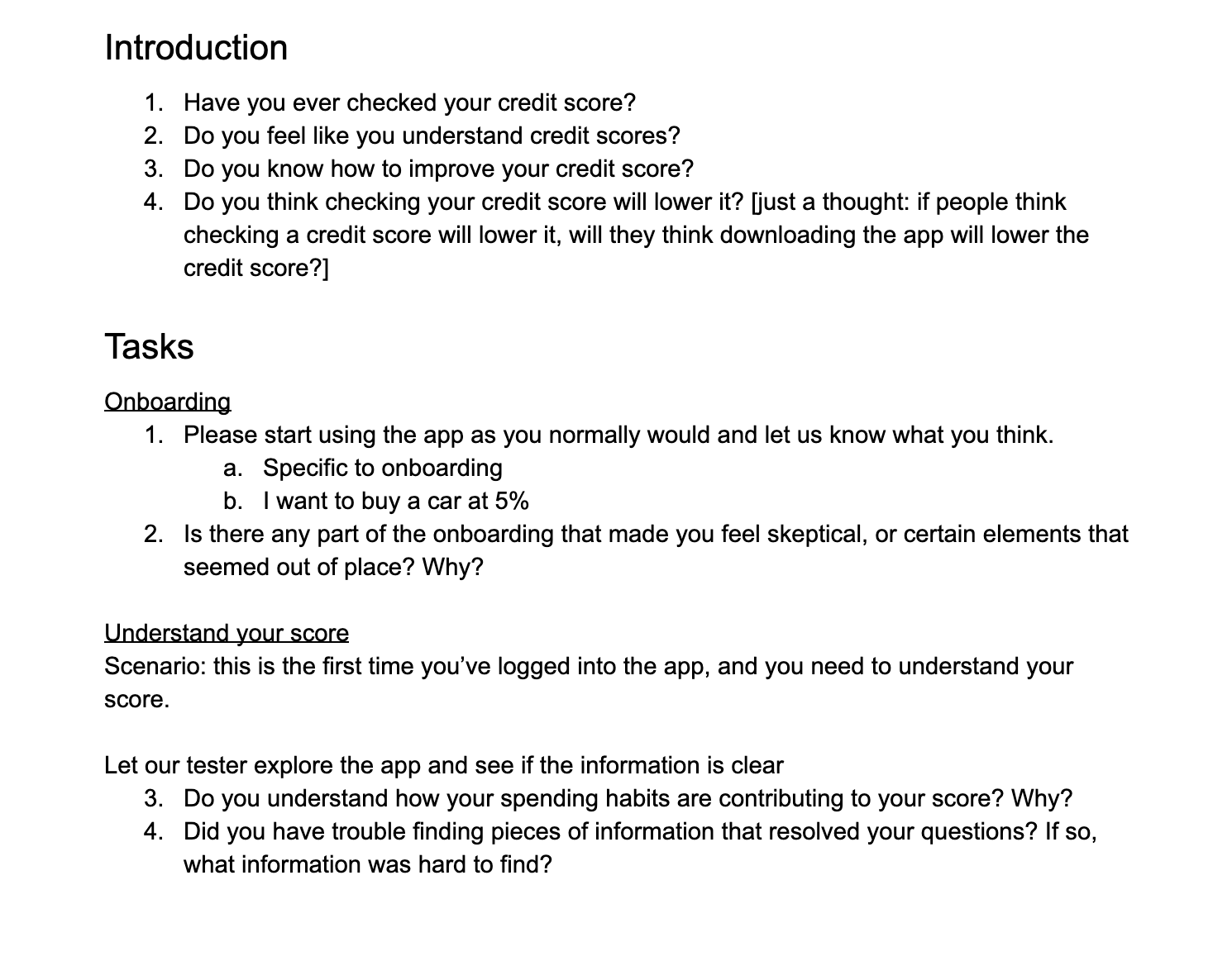
As a lead on testing for the team, I designed the user test plan for the team (Fig 3.1). For testing, I conducted in-person user testing with a think-aloud method. This allowed for the most pivotal feedback.
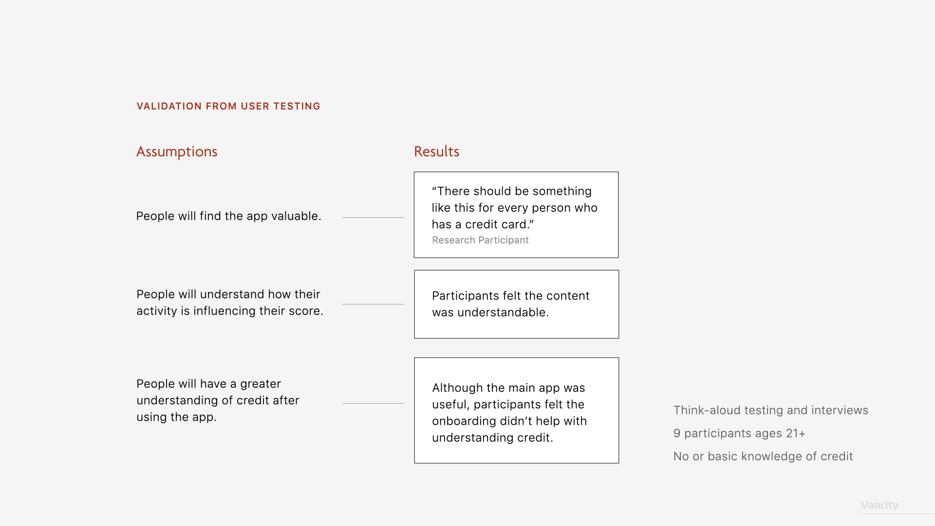
Through 3 weeks, we user tested with 9 participants. Our methodology involved:
- conducing A/B think-aloud user testing to look at the clarity of the app
- comparing two visual concepts to determine the final result (Fig 3.2)
- testing common workflow scenarios via a Flinto click-through prototype
By testing, we identified that we needed to explain credit better, specifically making on-boarding more relevant to avoid confusion. We also validated from A/B testing which version was easier to process.
How MyCredit Works:
Onboarding
Our onboarding explains credit, and links accounts from other financial institutions, to give a cohesive look at how factors and other accounts affect their score.
Goals
Curated information helps members reach their goal by giving them clear, achievable steps within a reasonable timeframe.
Learn
Based on the FICO Equifax factors, these are the 5 guidelines that influence your credit score.
Clicking on a factor reveals more insights about that specific point. We can point to actions here, such as enabling Pre-Authorized Payments, which can help members.
Custom notifications
Everyone manages their finances differently. With curated notifications, MyCredit recommends actions specific to each member's habits rather than providing generic information.
Celebration
We celebrate accomplishments and recognize members for their efforts, encouraging them along their credit building journey.
Sitemap
This is our imagined sitemap that would be needed for initial implementation and launch if Vancity was to make this available to members, to achieve the optimal experience for Vancity members.
Measurability & Defining Success
Our team was invited to present the full solution to Vancity's digital strategy team after the course concluded, with positive feedback from the team.
Financial literacy is an important component of all of our products and services at Vancity. The app demonstrated the unique financial needs of our members and community, with excellent design and a modern take on Vancity branding, this project inspired our Digital team to push for new user experiences. It is clear that the product was well researched and would produce the results that the team wanted.
-Aaron Walker, Manager, User Experience at Vancity


